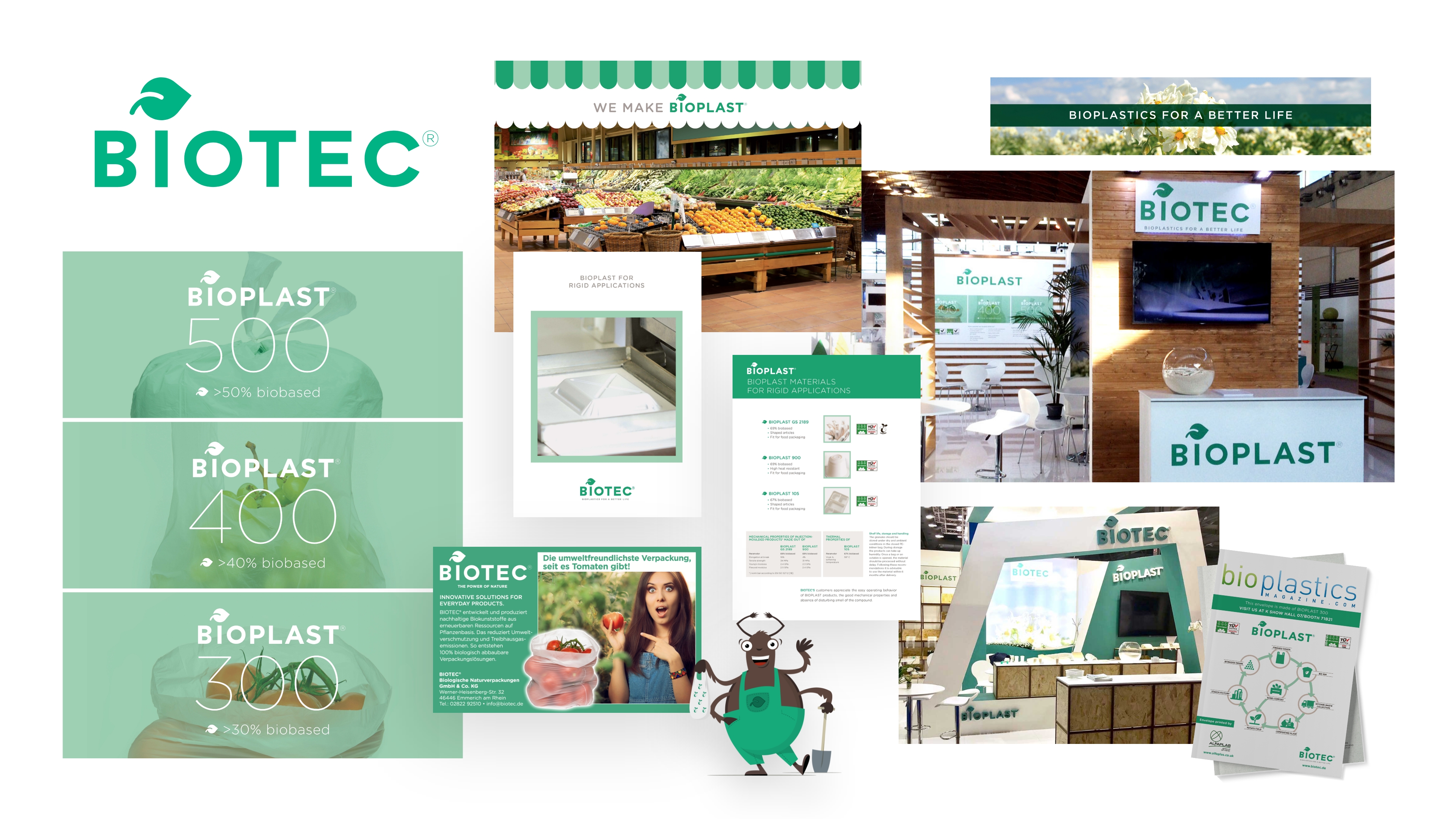
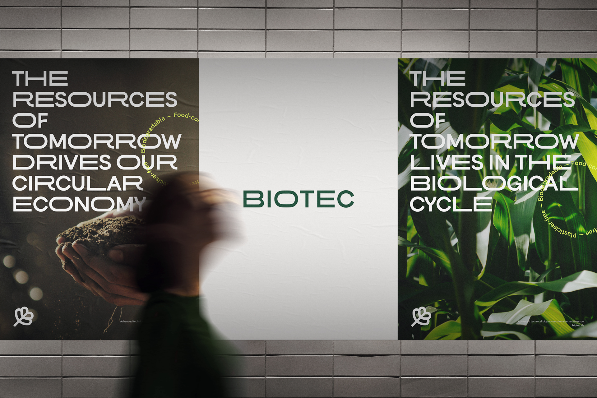
Biotec: Driving a more circular economy
Biotec is a biopolymer manufacturer based in Emmerich am Rhein. Together with converters and processors, the Biotec team develops and produces bespoke plant-based polymer compounds to satisfy specific parameters and legislative requirements. A new corporate design and website are created to reflect a new, focused, proactive brand position, and core values that better differentiate the brand and resonate with its audience.
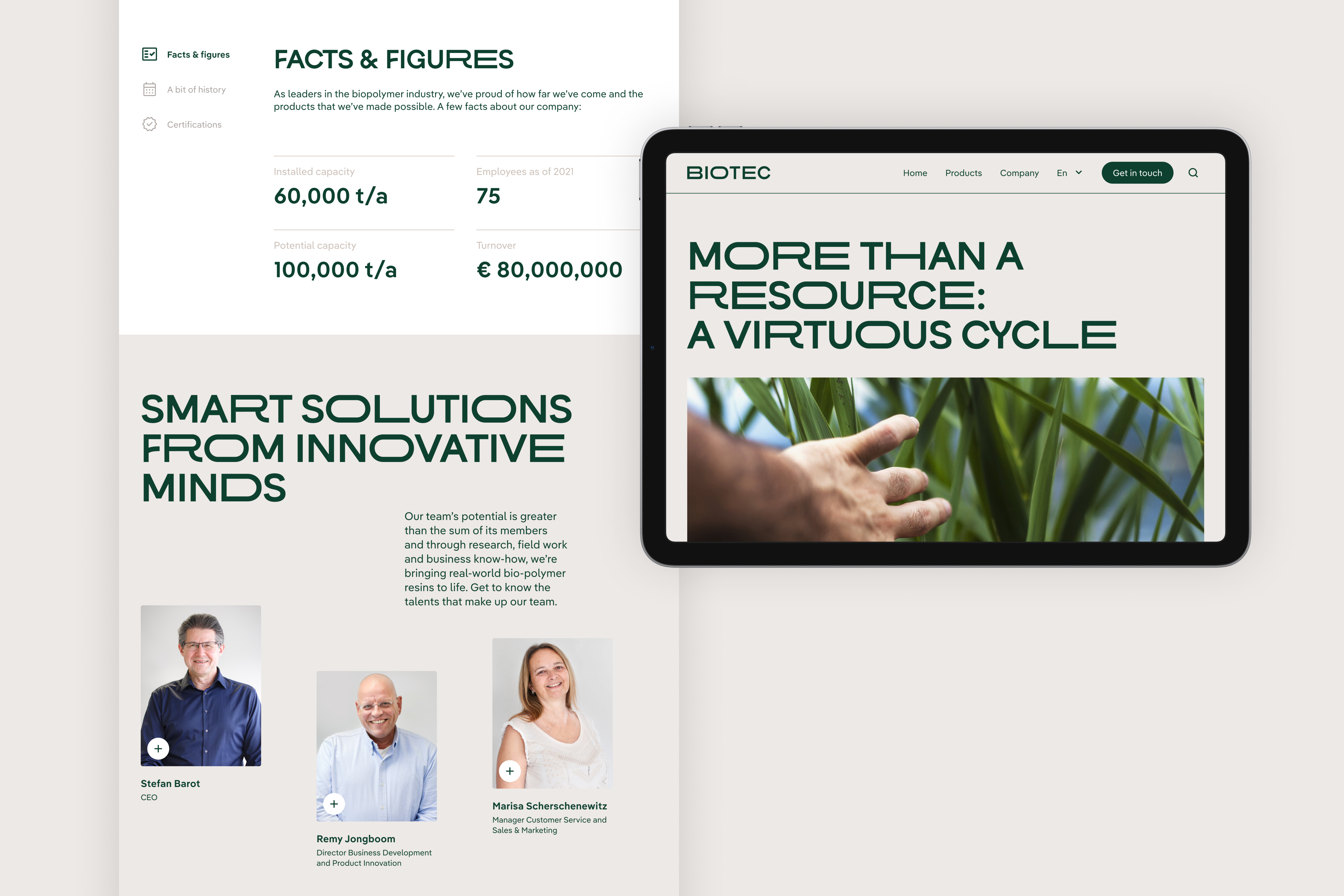
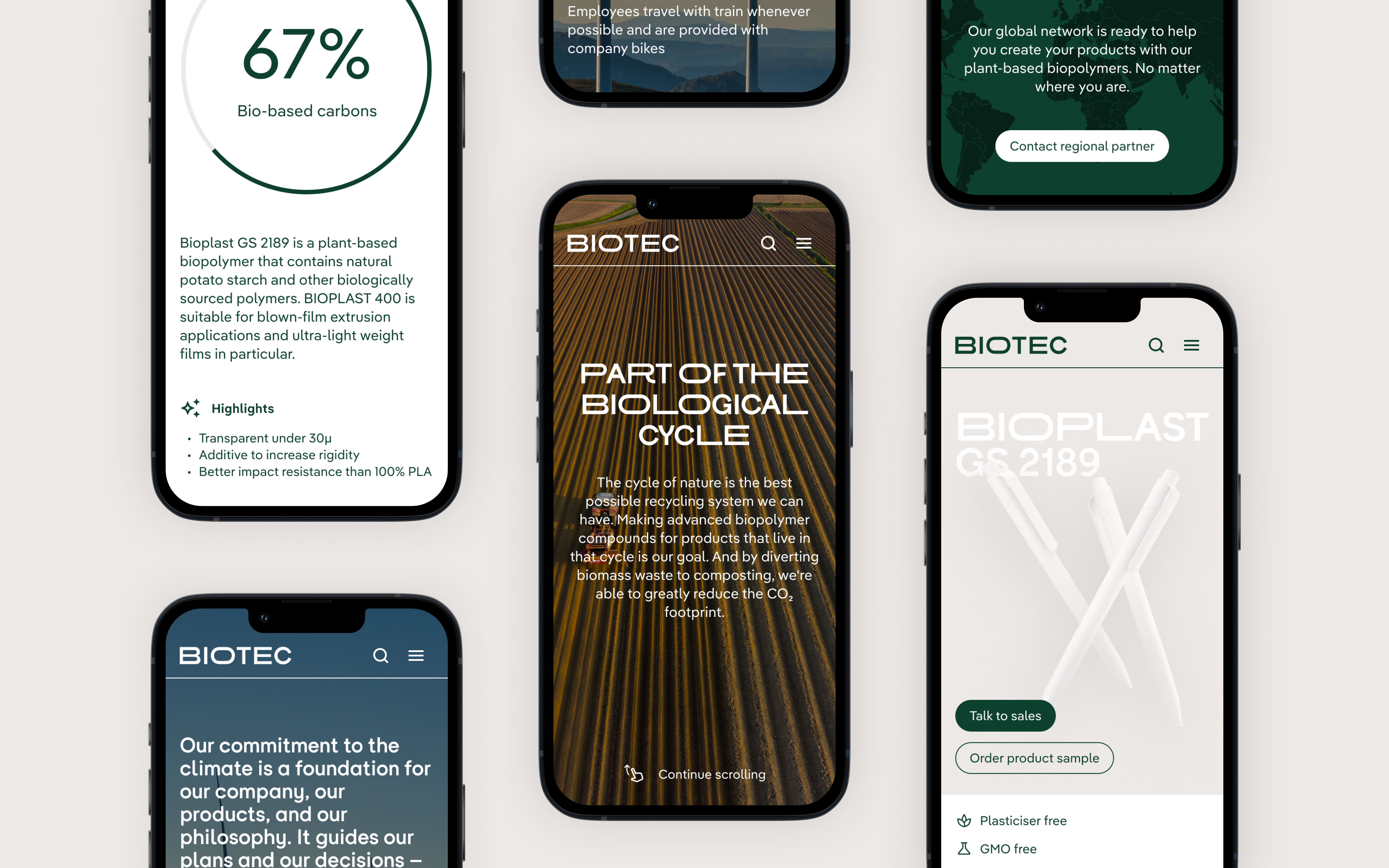
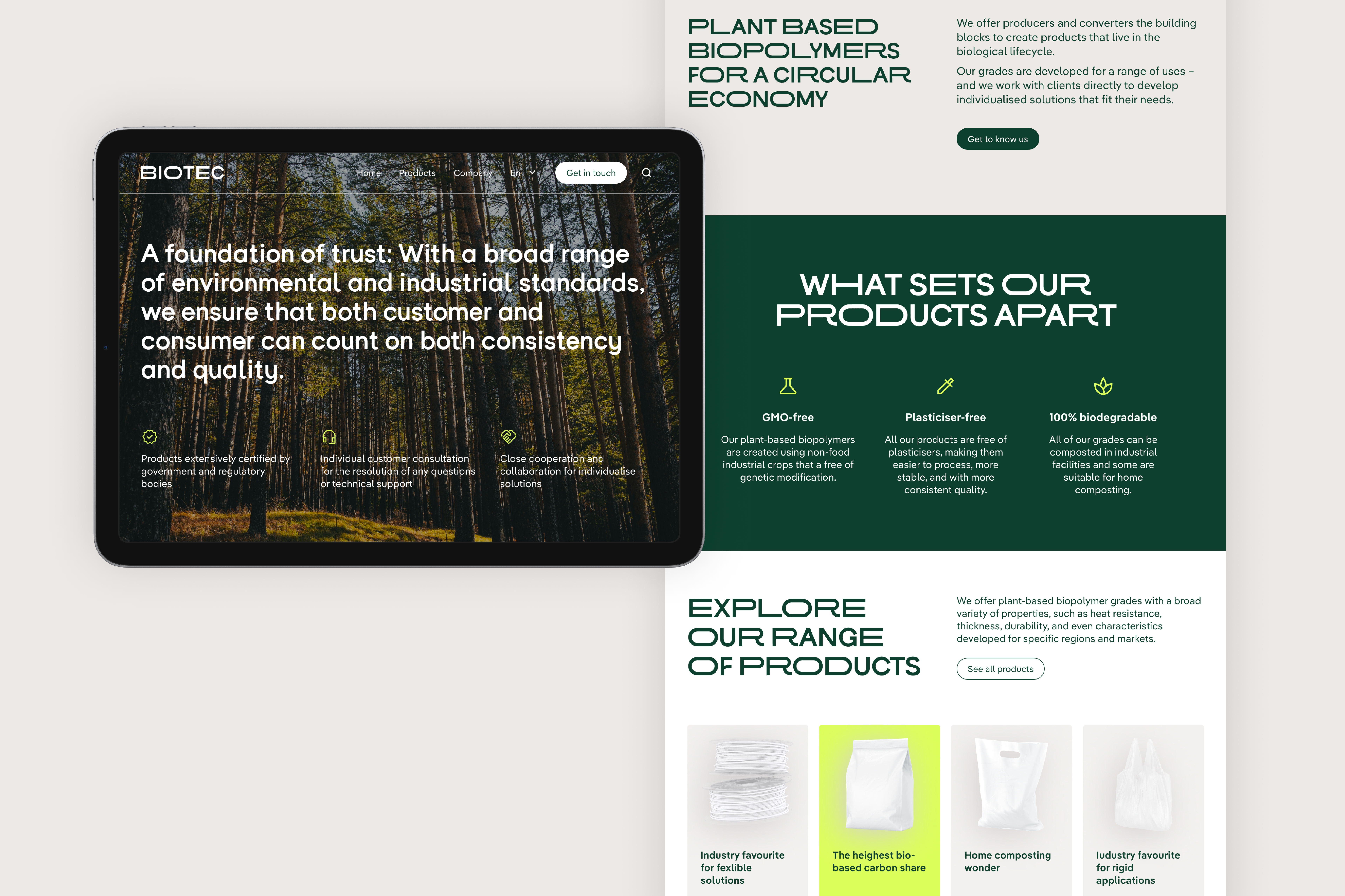
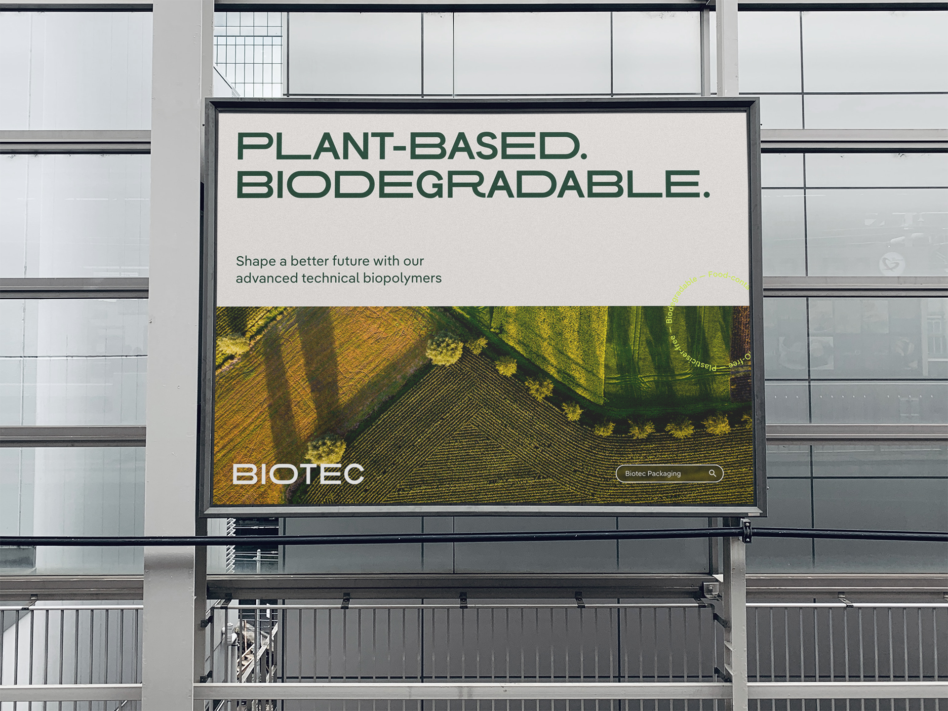
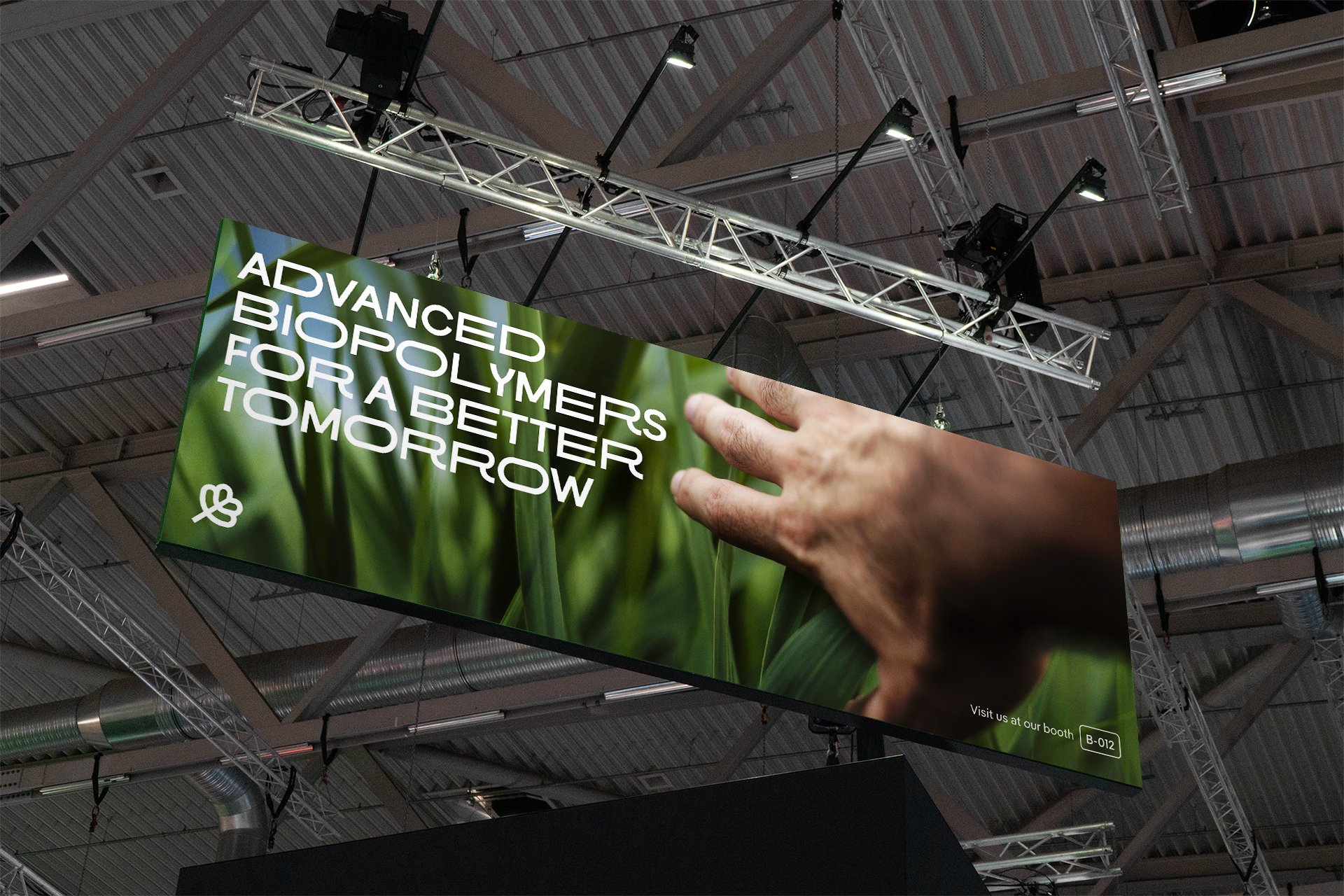
Biotec's advanced biopolymer compounds are made from GMO-free industrial crops, plasticiser free, and biodegradable at home or in industrial facilities. With a growing family of biopolymer grades intended for a wide range of processing methods and applications, Biotec uses resources that originate and return to nature to create and drive a more circular economy, with the aim of building a better tomorrow.
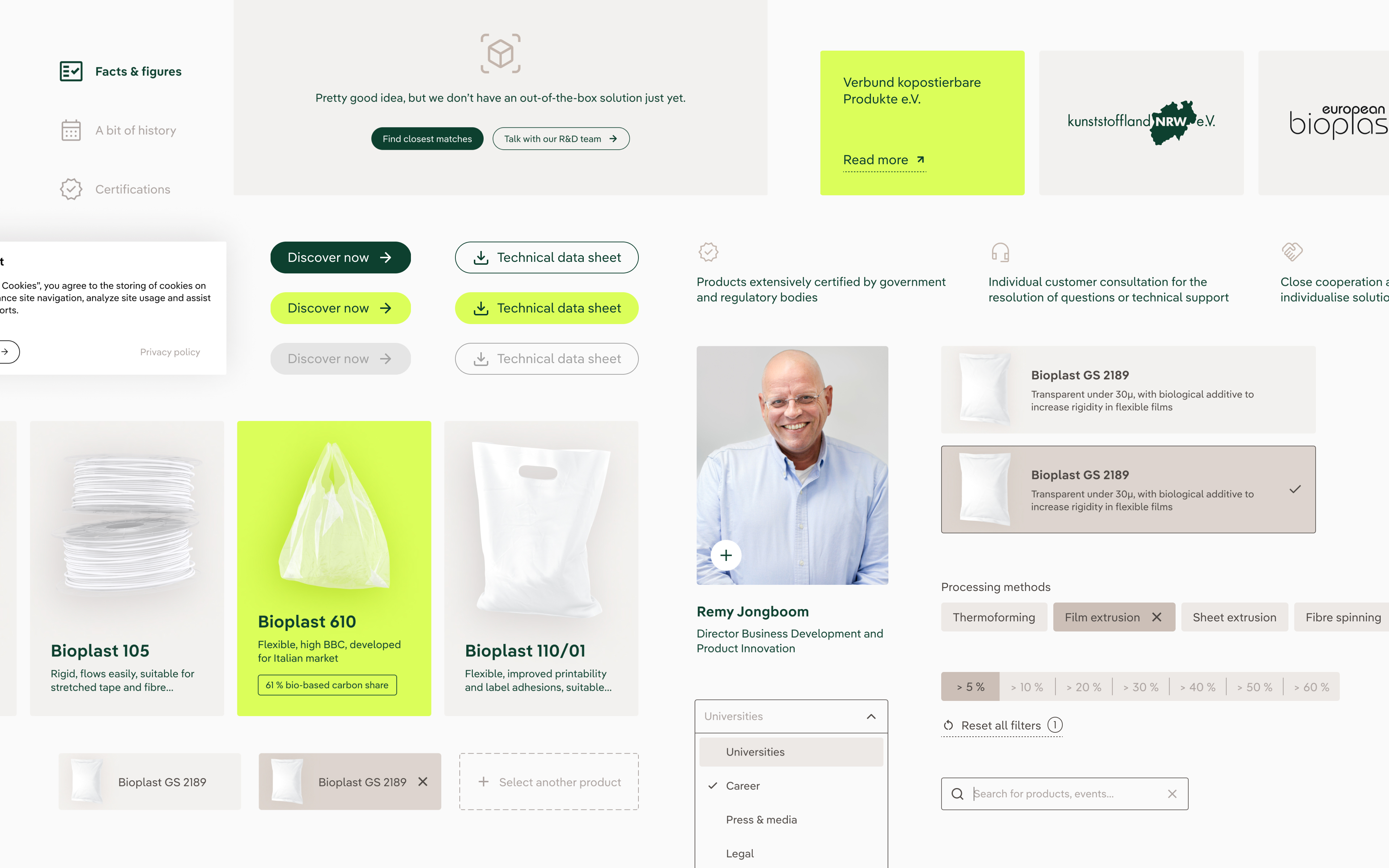
To achieve this objective, Biotec sought a new corporate identity that would set them apart from their competitors, and a new visual toolkit to better communicate their expertise, intentions, and product features with their stakeholders.
A visual scan of the existing brand highlighted the lack of a coherent design system. This and a nondescript graphic language that blends into the competitive landscape means inconsistencies exist between media and communication channels, diluting the core brand experience.

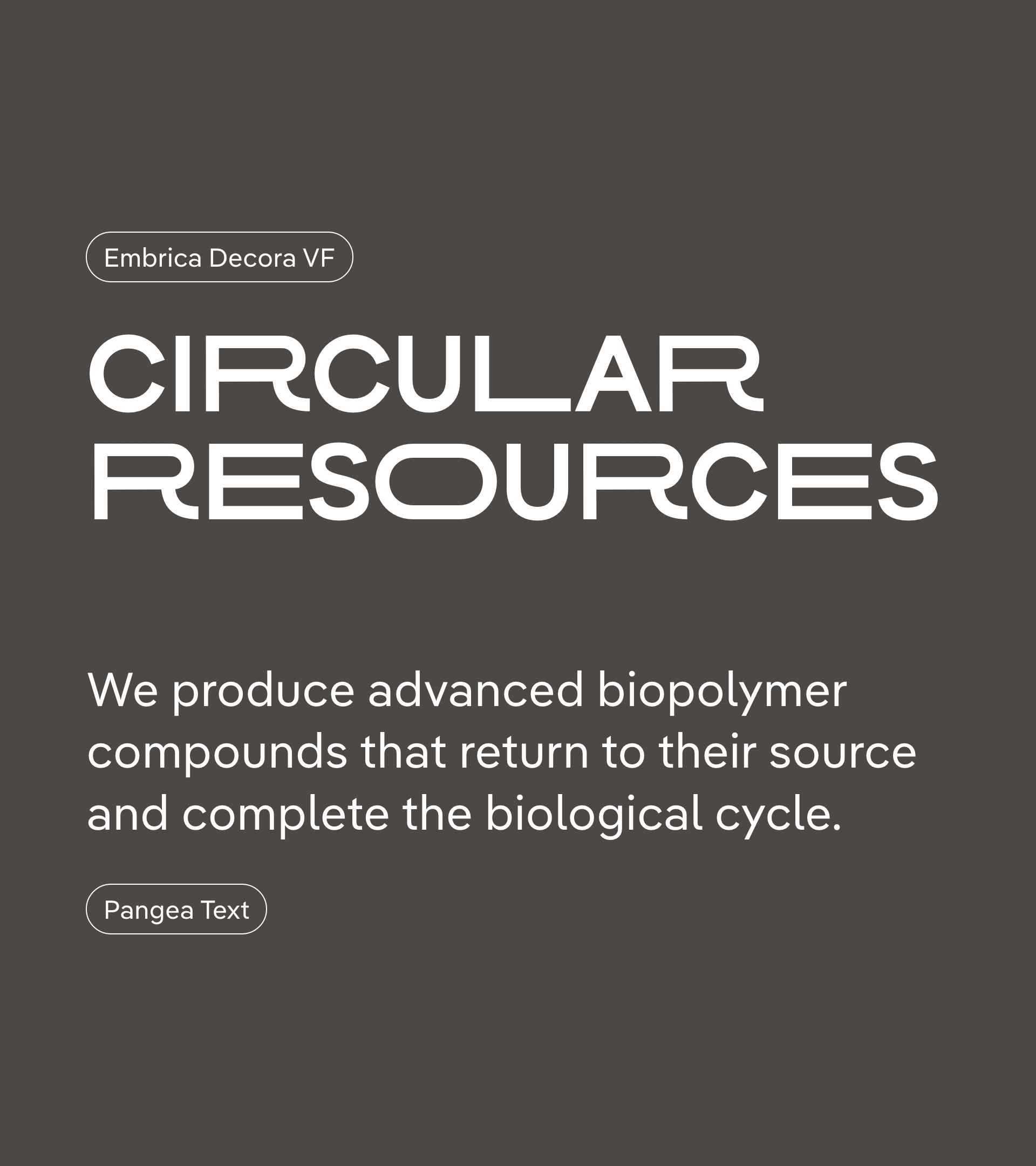
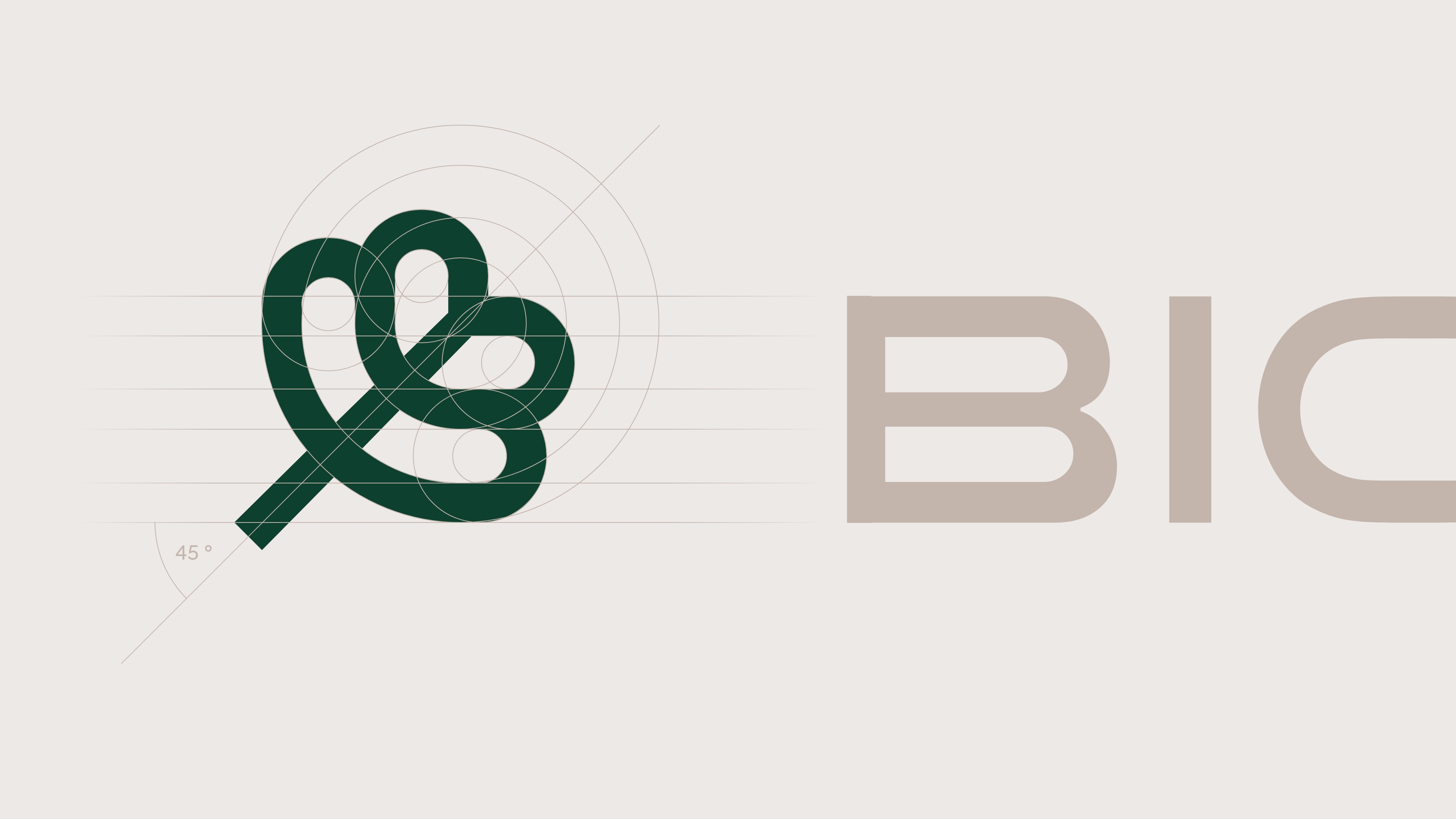
The team collaborated with format.otf to create the custom variable display typeface Embrica Decora, from which the new wordmark is developed. The geometric construction and exaggerated proportions of the stretched glyphs form a bold, expressive, technical, and instantly recognisable visual language.
Pangea Text, a beautifully crafted text typeface from Fontwerk is selected for use in longer copy. The font offers optimal legibility in running texts, and counters the display typeface with a more neutral stance, softer appearance, diagonal terminals and slight ink-traps.


Biotec Naturverpackungen
Brand design
Monospace: Jonas Vogt, Daniel Albert
Digital design
Monospace: Jonas Vogt, Christoph Buettner, Paul Mang
CGI
Neo Motion Studio
Motion Design
Monospace: Lennart Kramp