Shieldex: Metallised technical textiles for challenges of the future
Like many successful family-owned “mittelstand” companies in Germany, Shieldex has had a long and successful 40-years history. As a new generation took over leadership roles, the company is looking to differentiate itself from the pack. With a new brand identity and visual design, Shieldex is confidently taking on the challenges of the future.
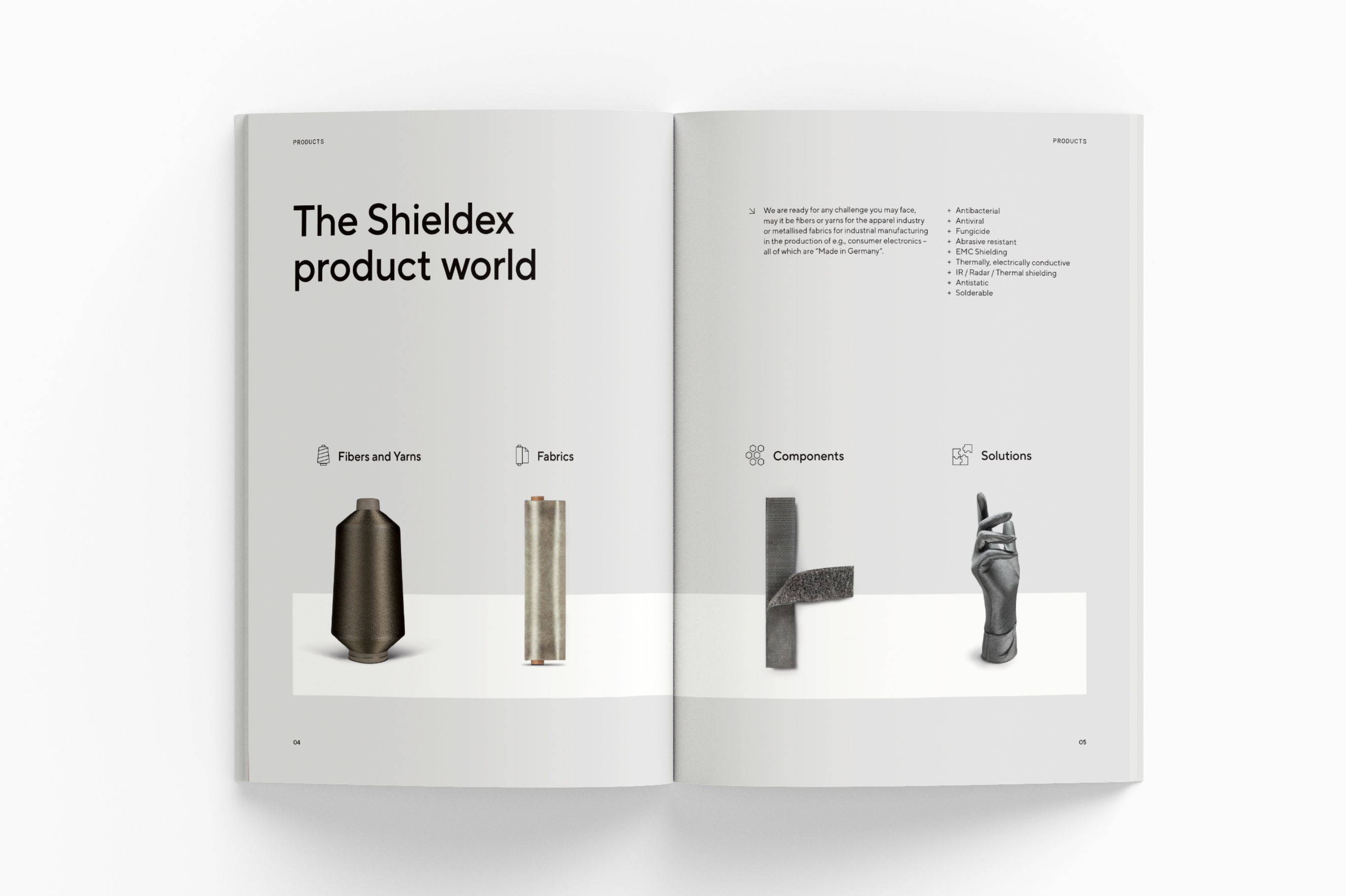
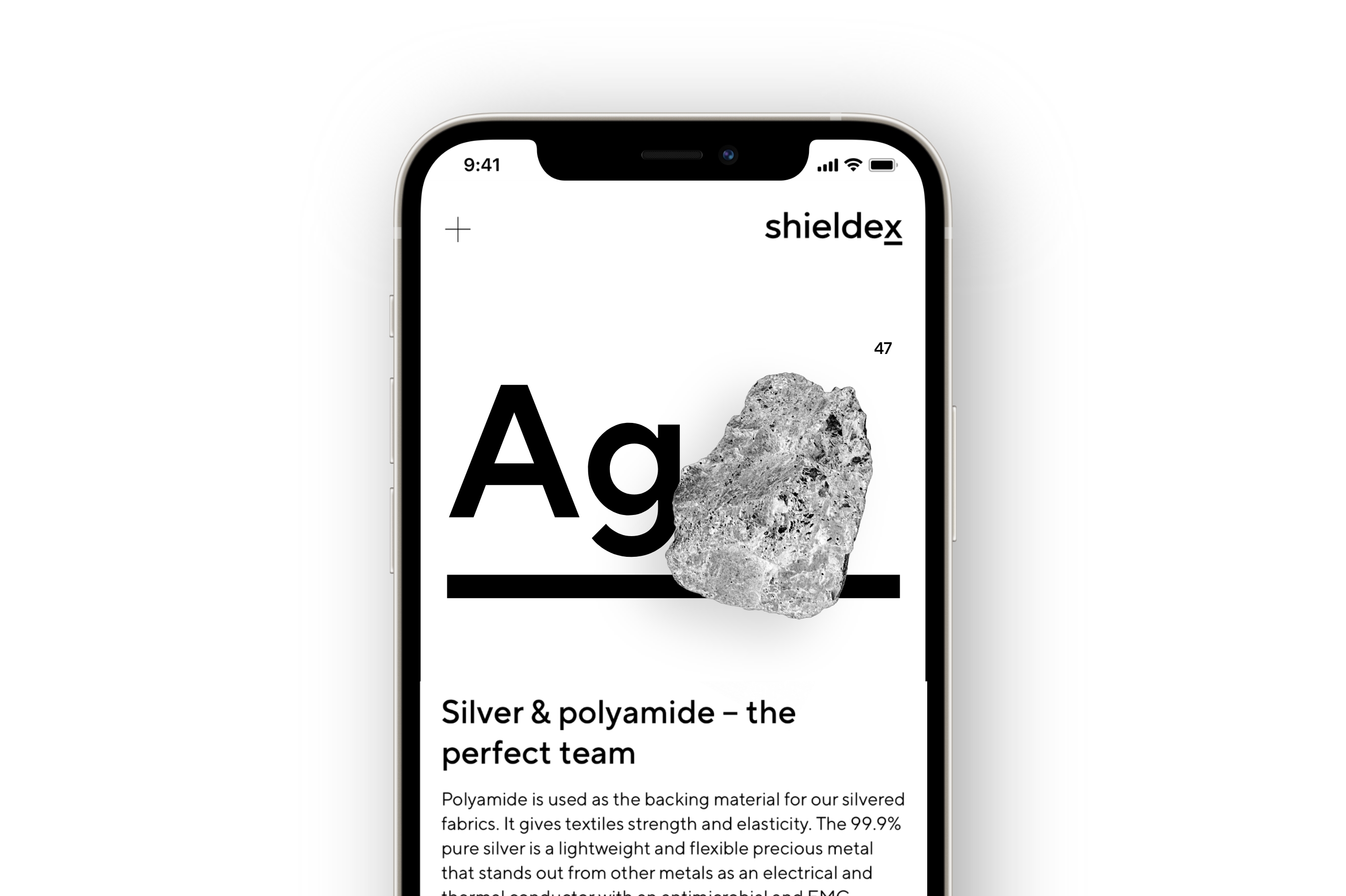
The Bremen-based company is a hidden hero behind countless industries. From consumer electronics and aerospace engineering, Shieldex combines pure silver, copper, tin and nickel with polyamide to create customised metallised technical textile solutions.
Despite its success, Shieldex finds itself lost and competing in a sea of German “Mittelstand” companies, characterised by their often vague, tame and outworn brand and visual identity. The company needed to reiterate their defining values, and reposition itself to serve a broader, internationalised market.
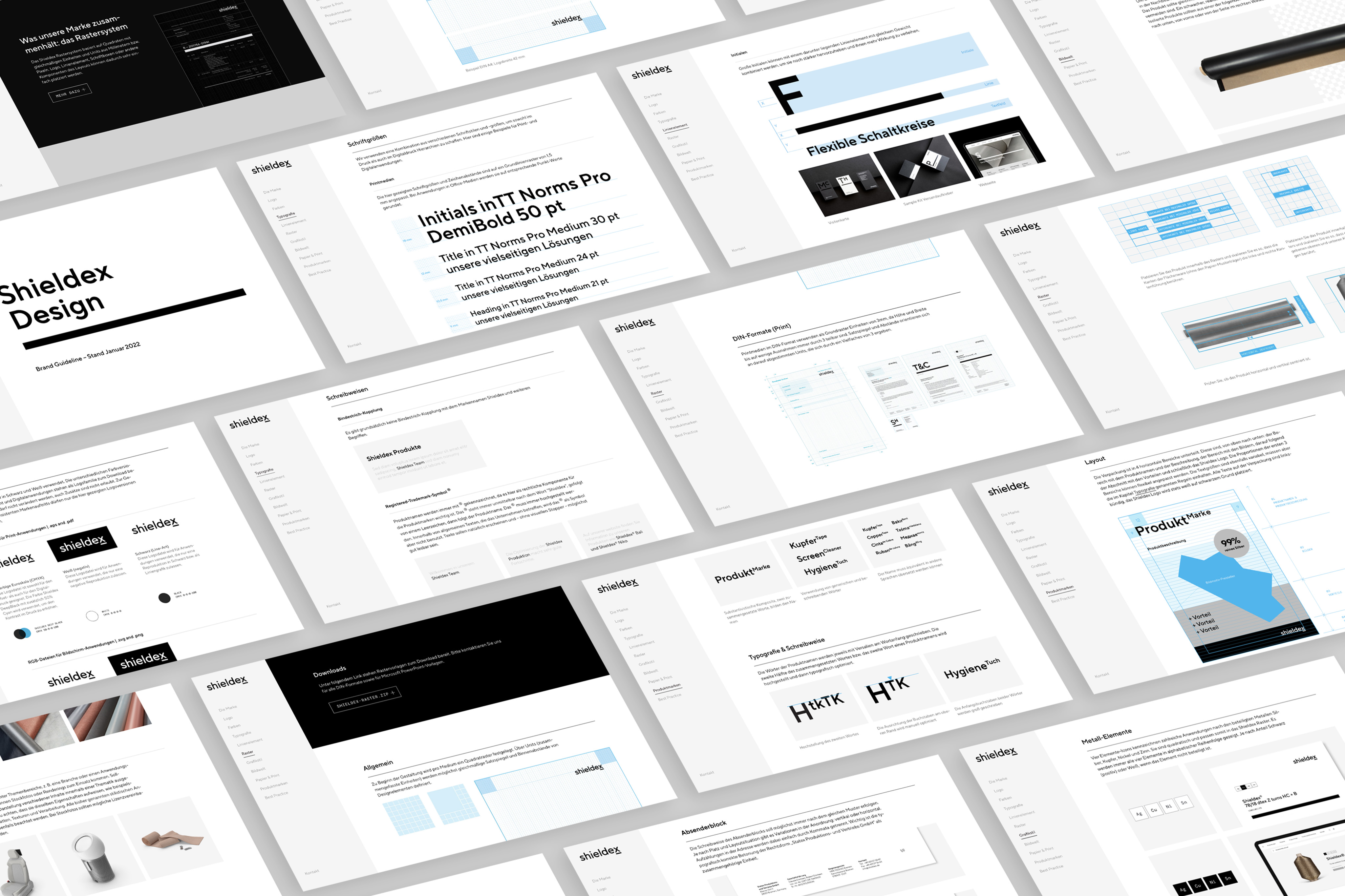
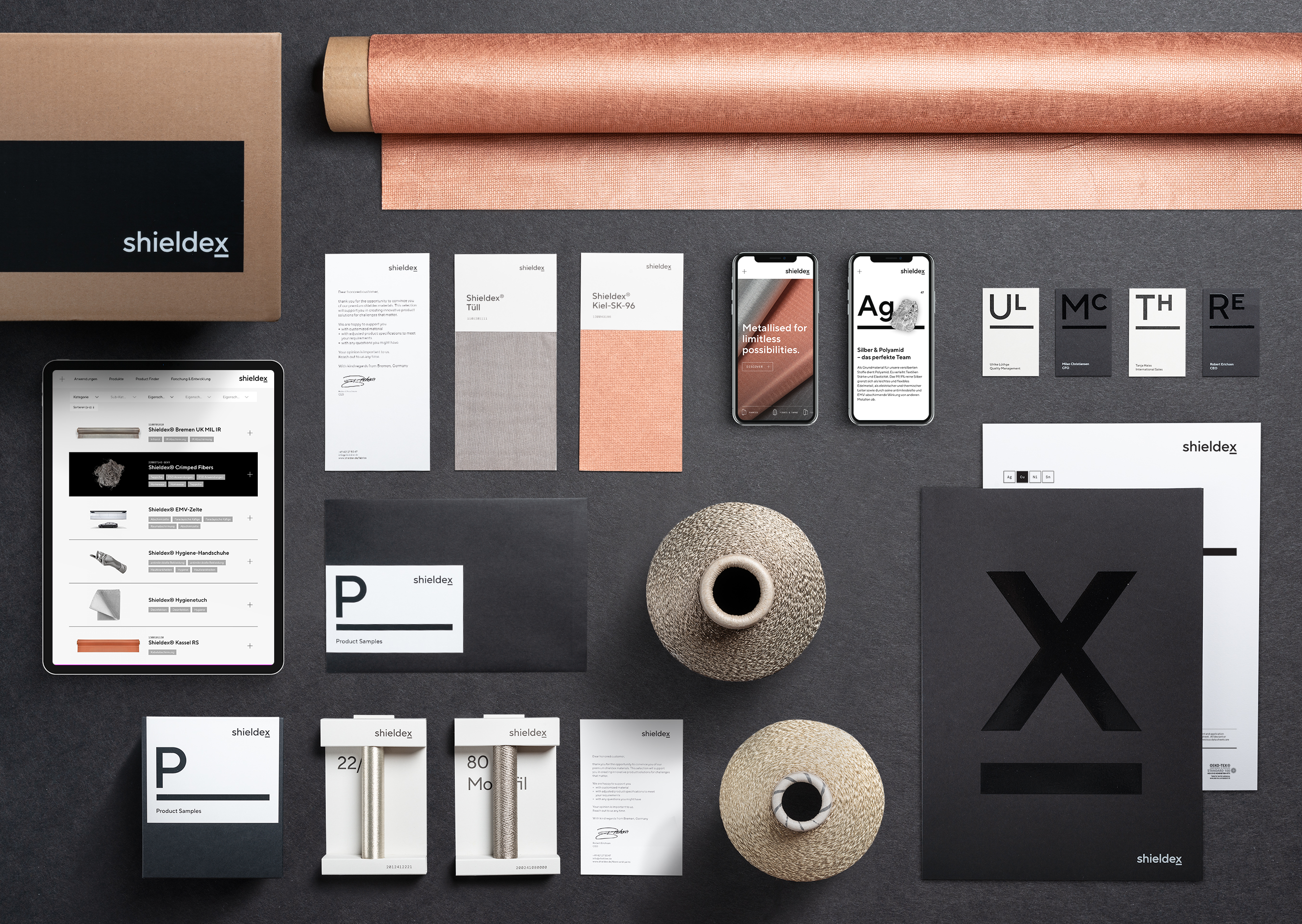
Inspired by the scientific rigour and the nature of Shieldex’s business, the new visual language is direct, precise, and accurate. Derived from elements within the periodic table, each ingredient of the new design system can function on its own, or come together to create limitless variations and possibilities. Final deliverables included web design, packaging design for product samples, stationery, technical data sheets, and documentation in a digital brand guide.


Visual identity toolkit: a new formula for success
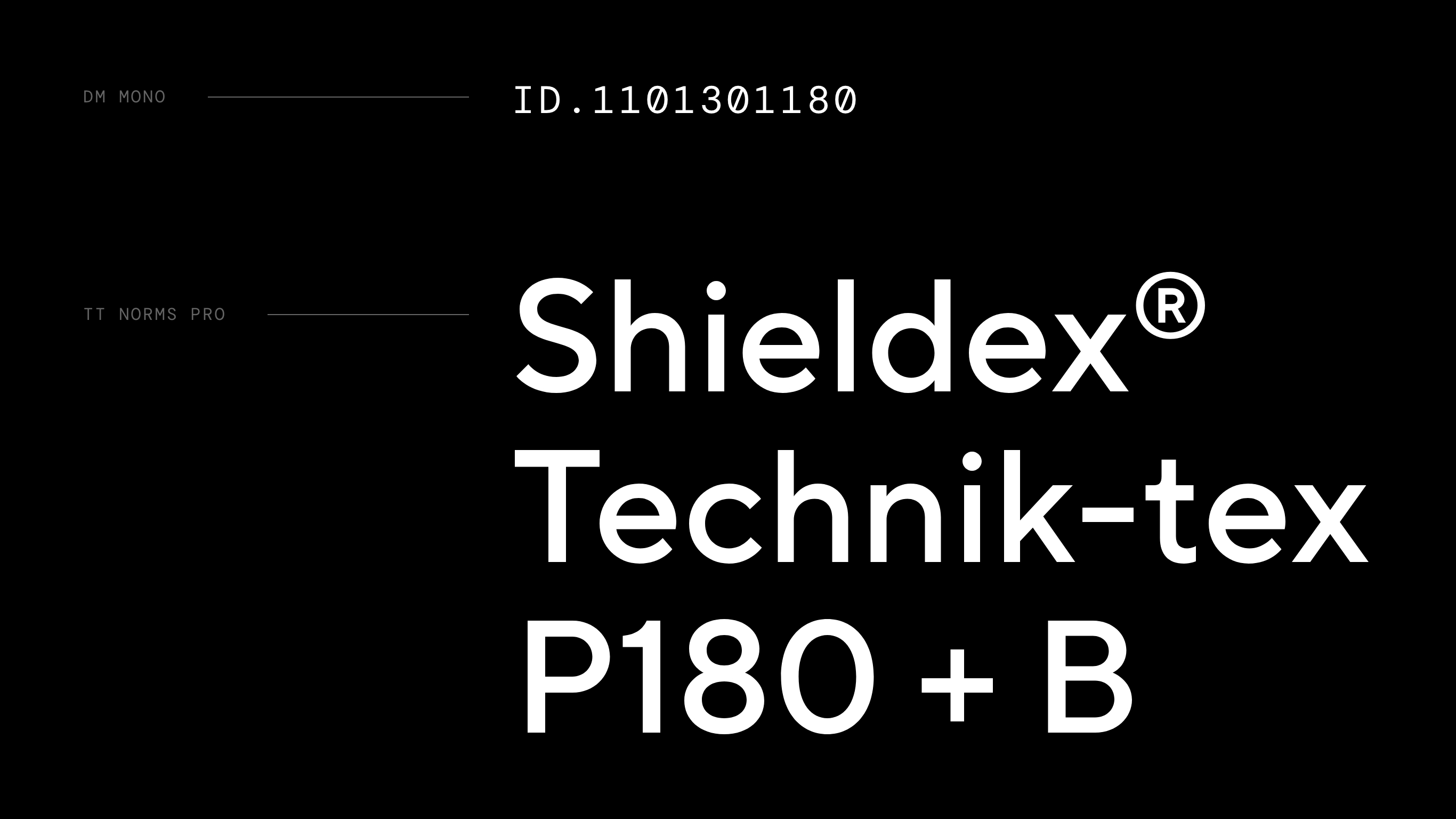
Formally derived from element symbols within the periodic table, typography and the line element brings structure to the new design system. The formula for success is perpetuated in the name: The line emphasises the X as a placeholder for the infinite possibilities textile solutions create.
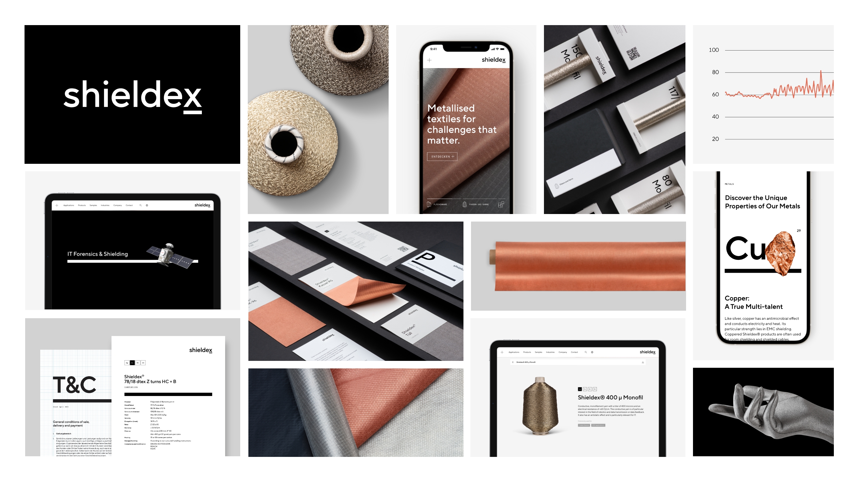

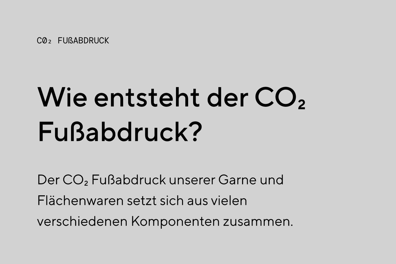


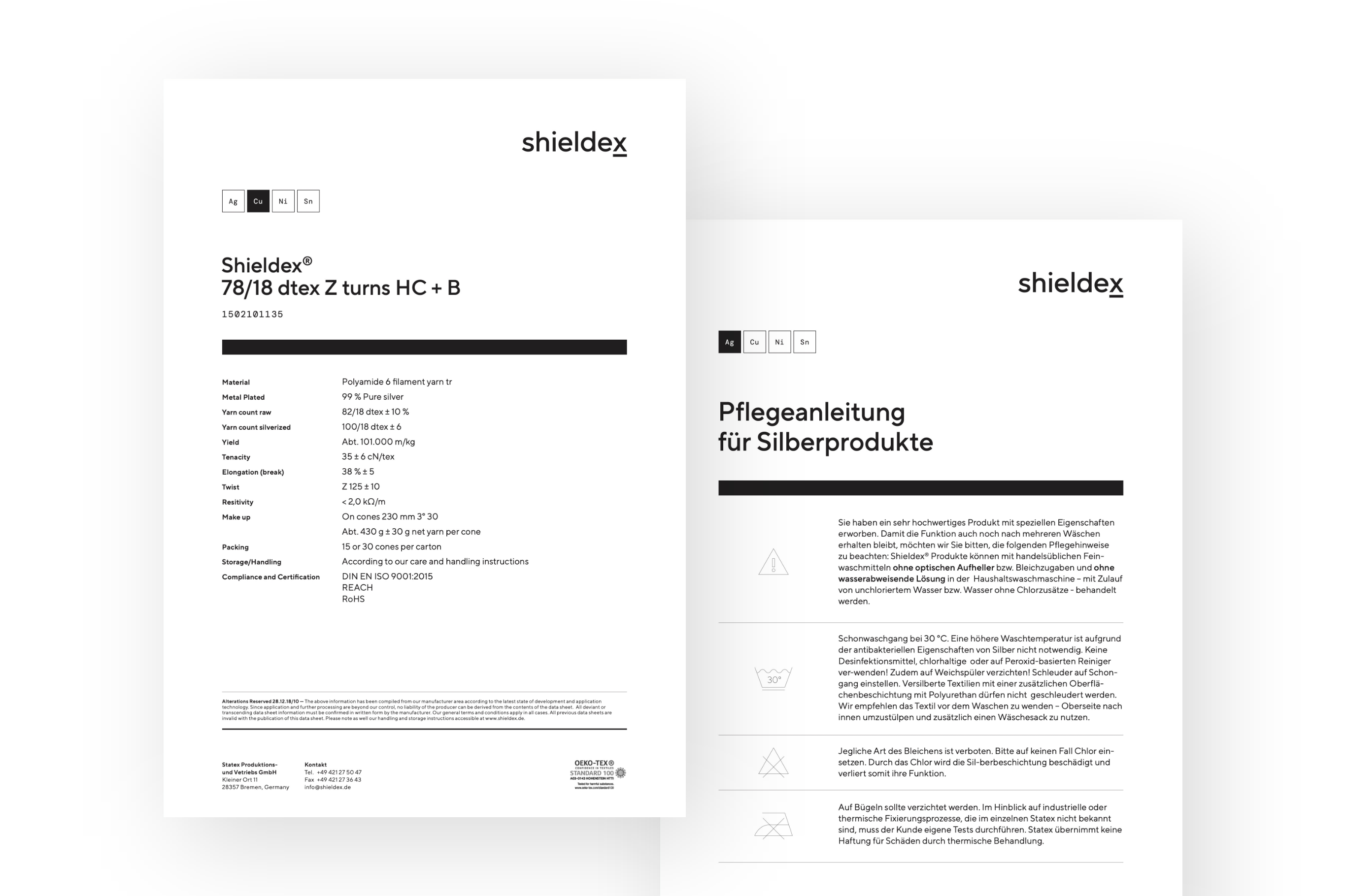


Icons, diagrams and infographics convey technical expertise and are characterised by a simple, clear, grid-based design.
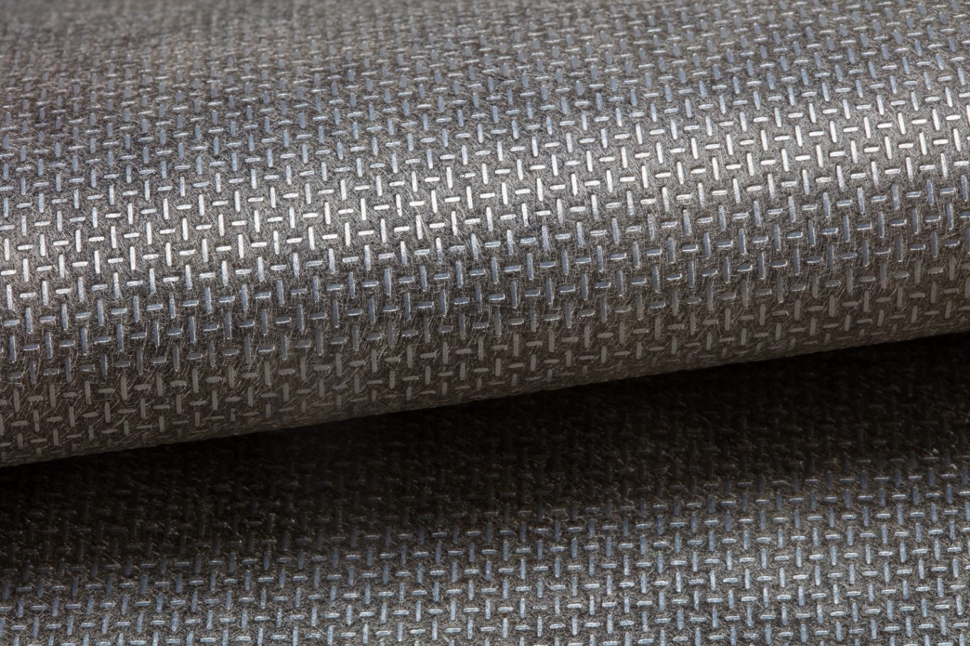
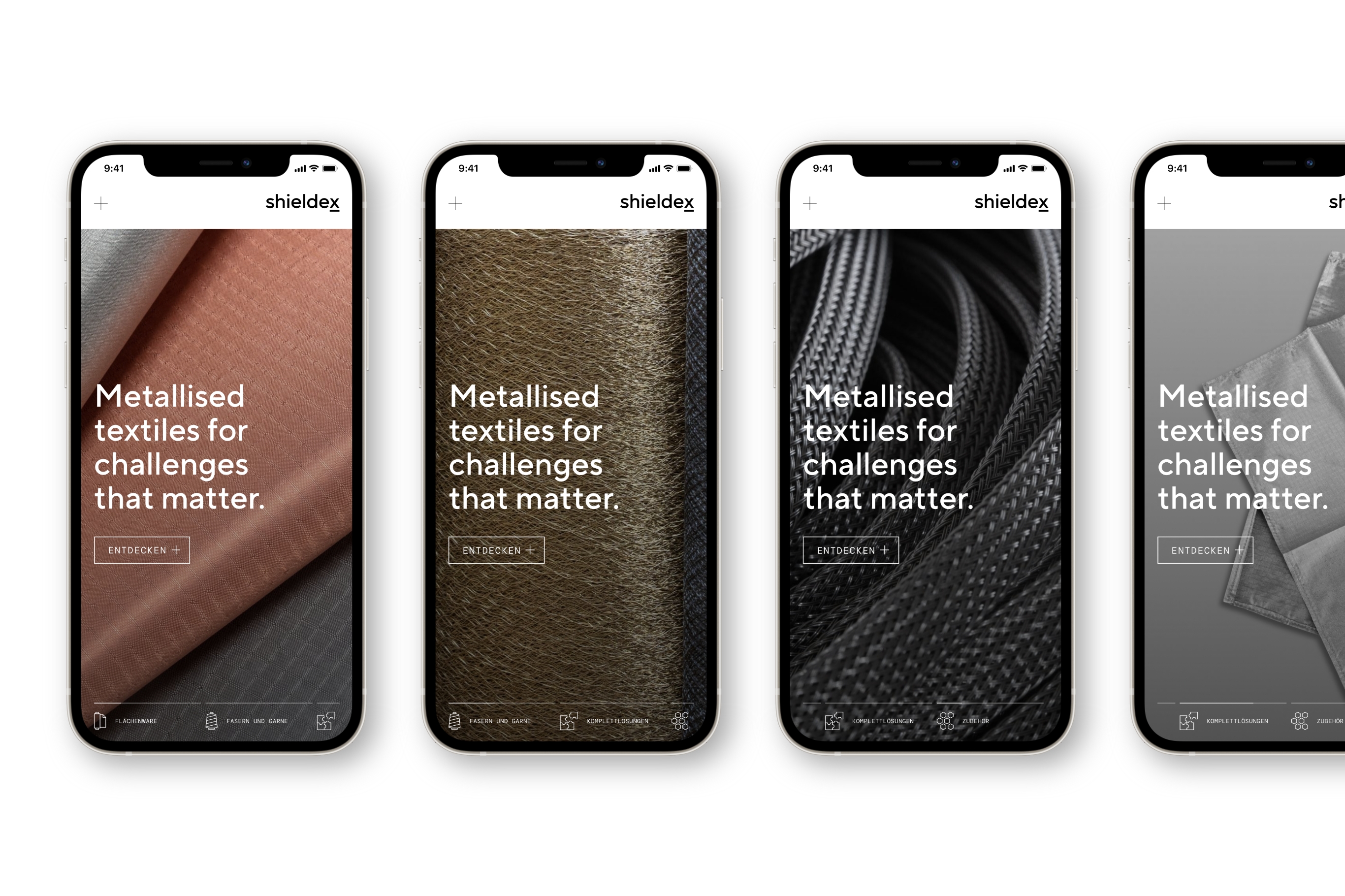
Photography plays a pivotal role in the new design system. They focus on the colours, textures and surfaces of the products, always presenting the product in the best possible light.
Finally, the new brand strategy framework, extensive design principles, guidelines and all visual assets are painstakingly documented and presented in an online brand management portal to ensure a single source of truth for the team and external partners.
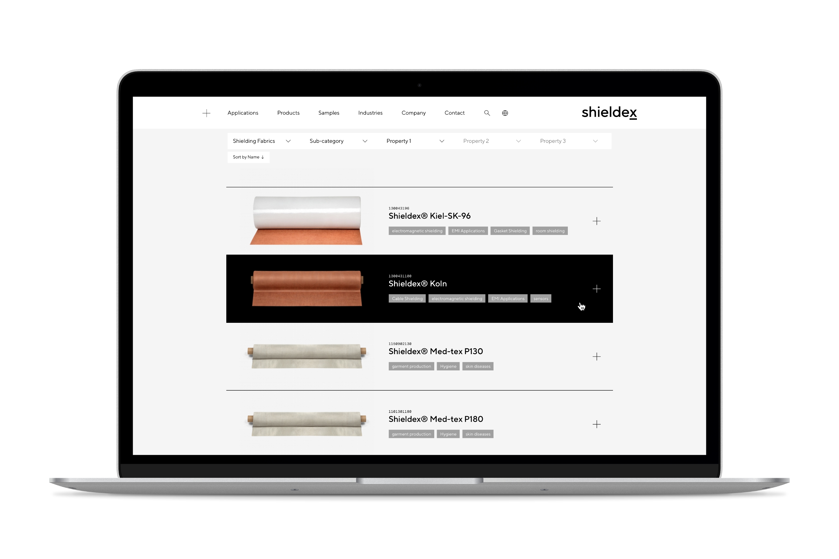
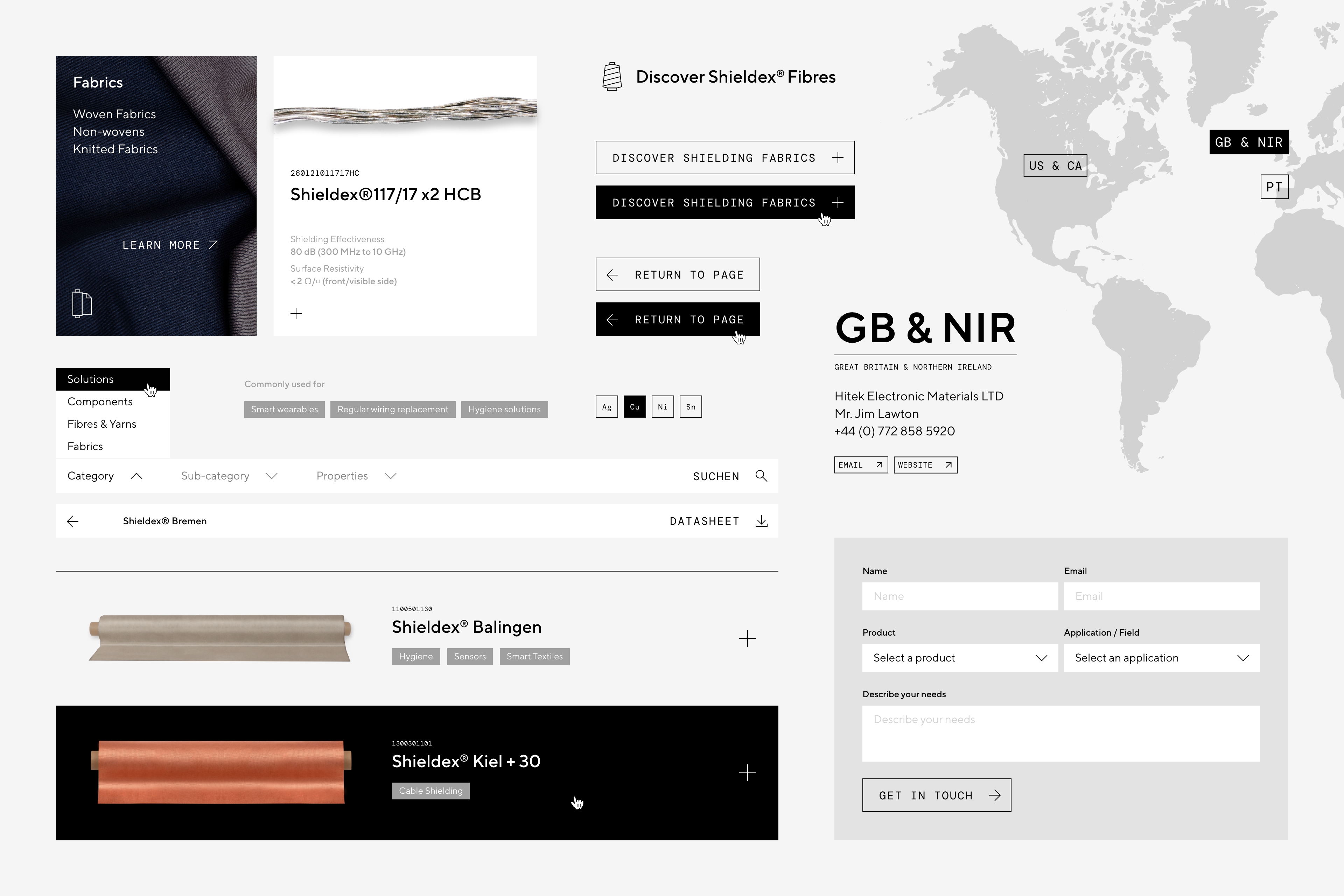
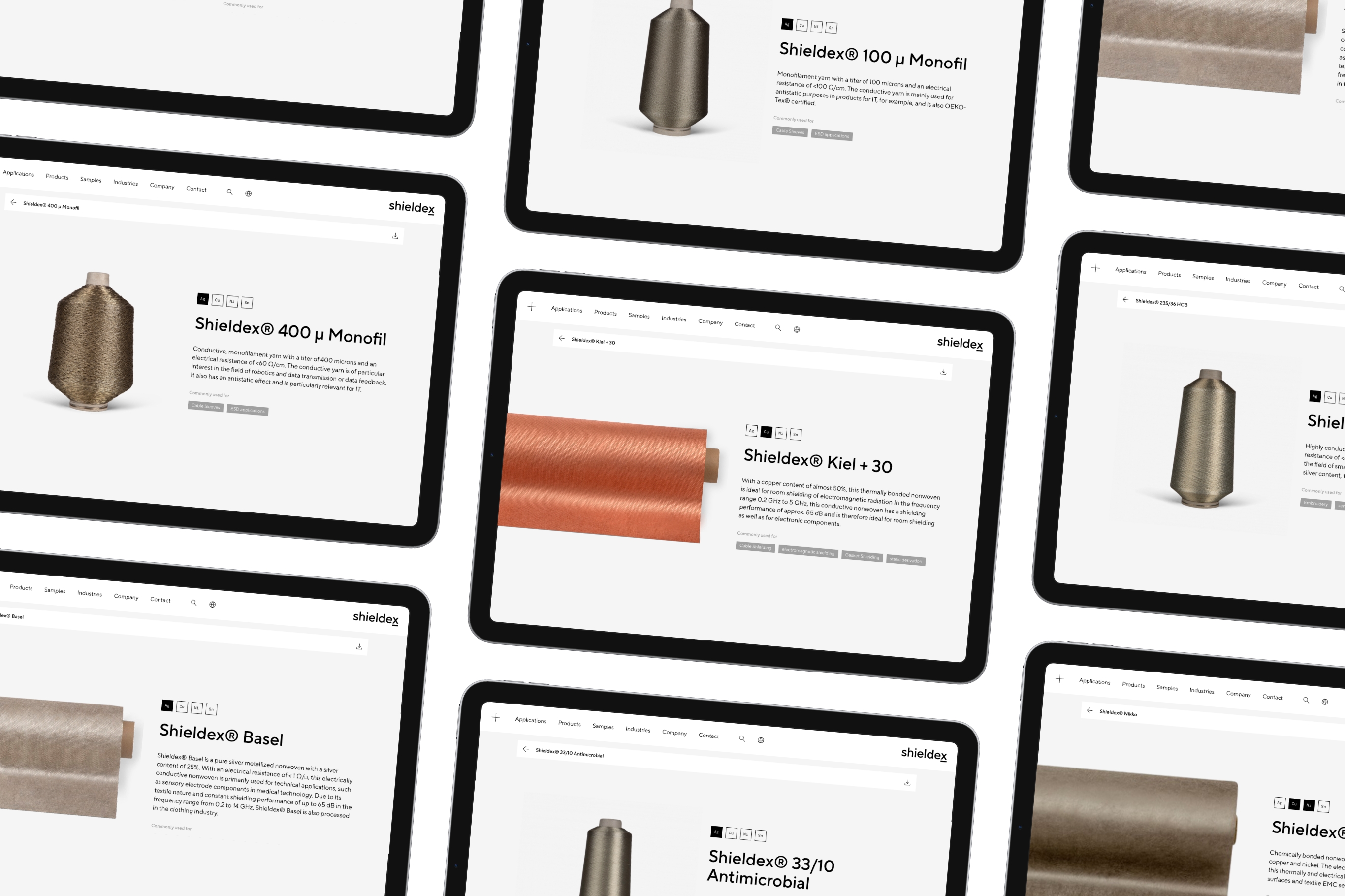
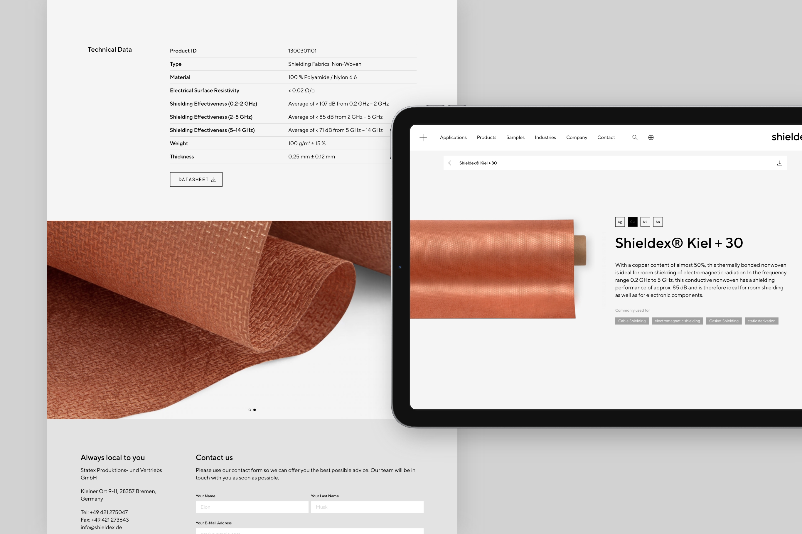
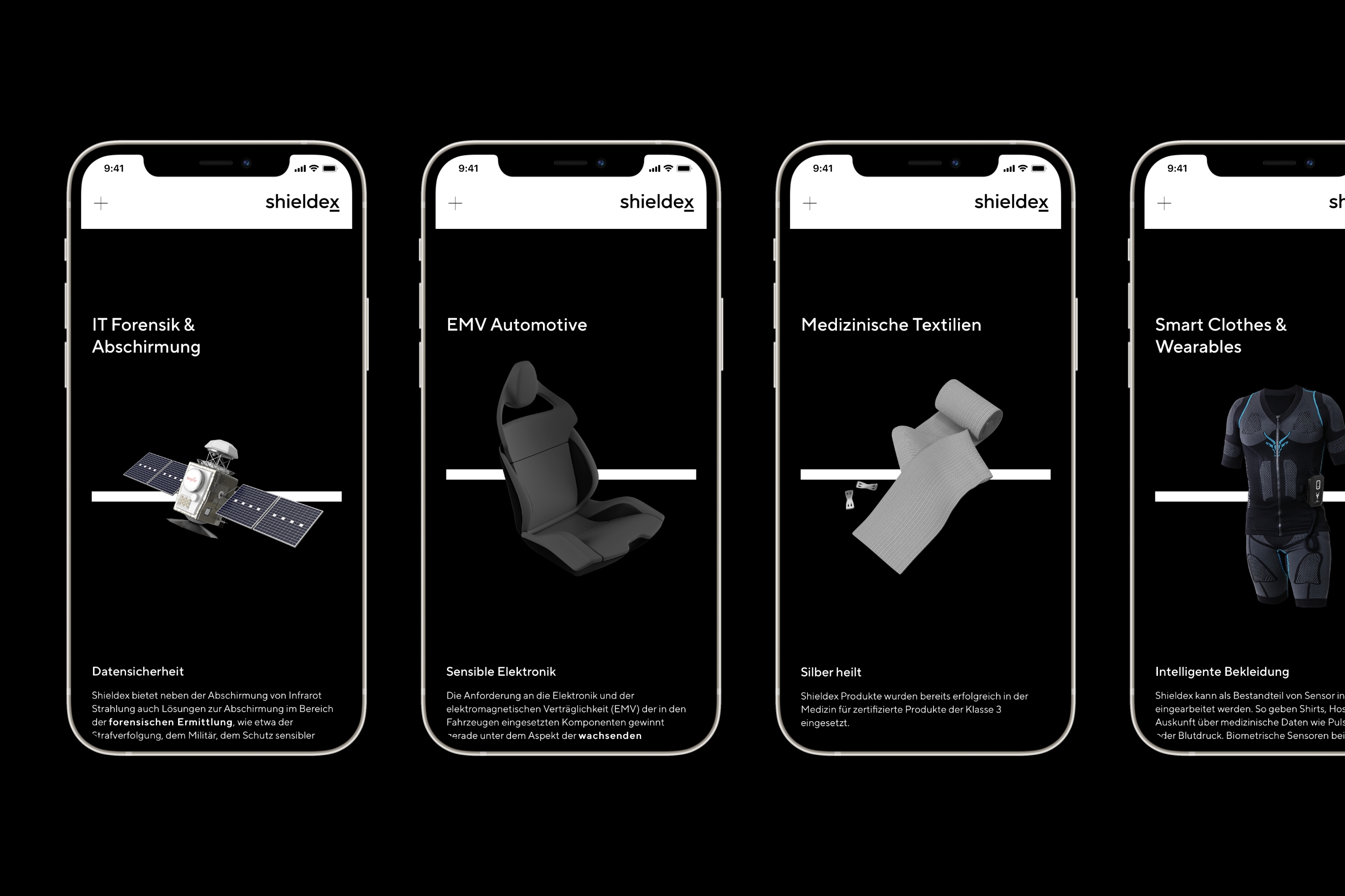
Website and product catalogue
The new website showcases the family-owned company and confidently communicates its offering as an innovative and dedicated tech partner with leadership aspirations. A customised product finder provides quick access to Shieldex's extensive portfolio of fabrics, yarns, components and solutions, all the while highlighting the high standard of quality in everything they do.


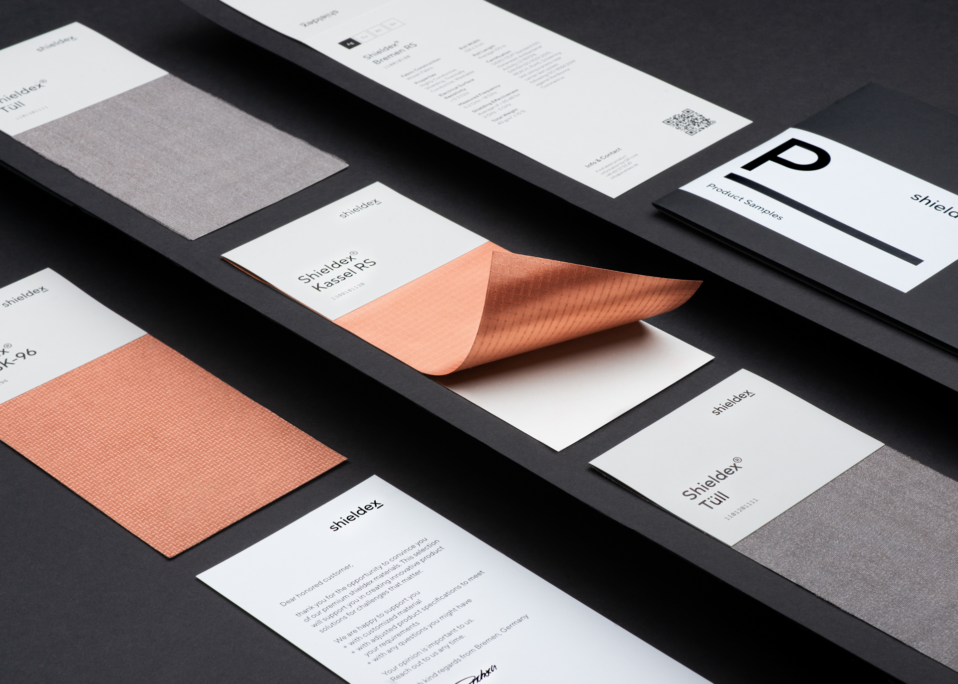
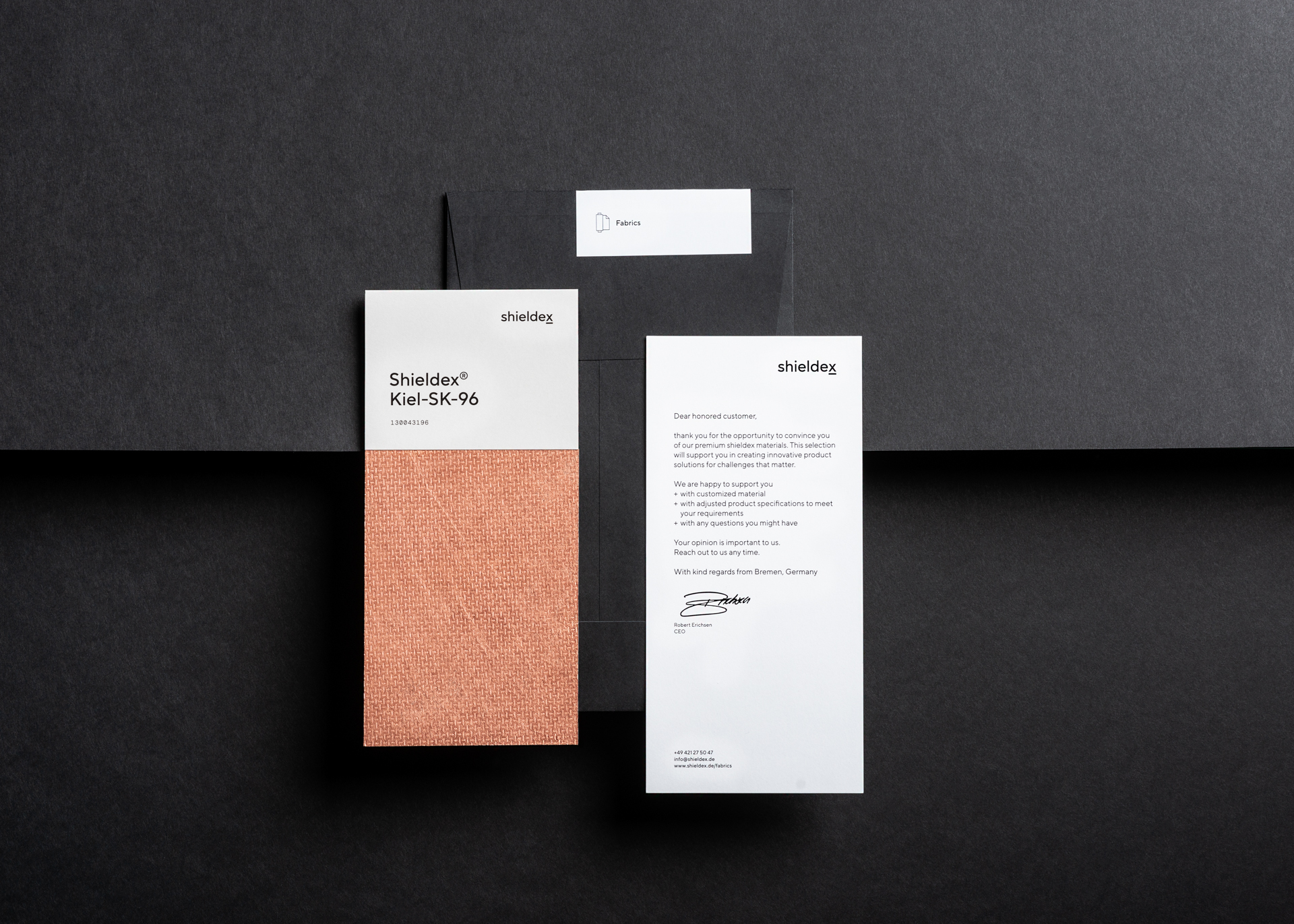
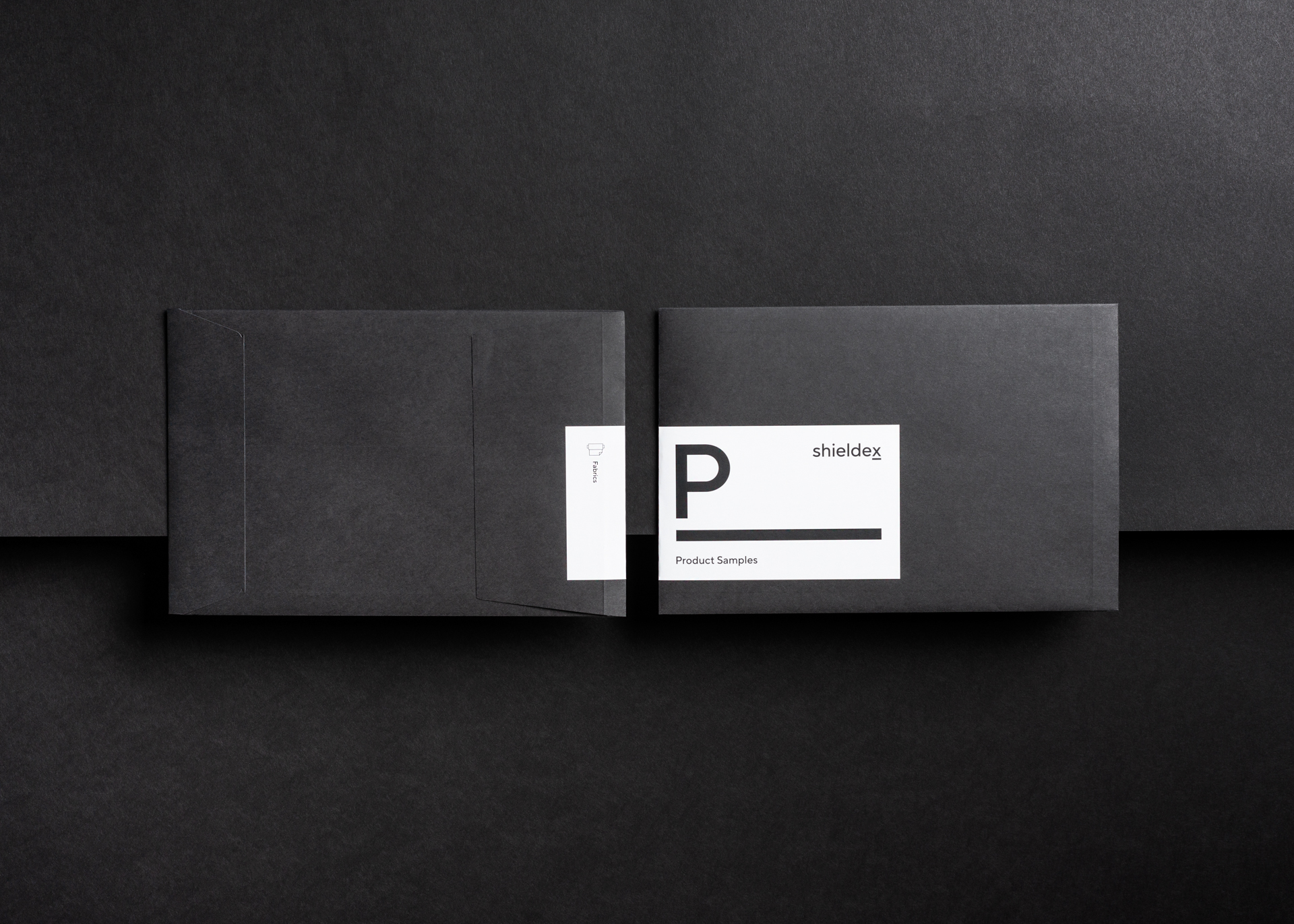
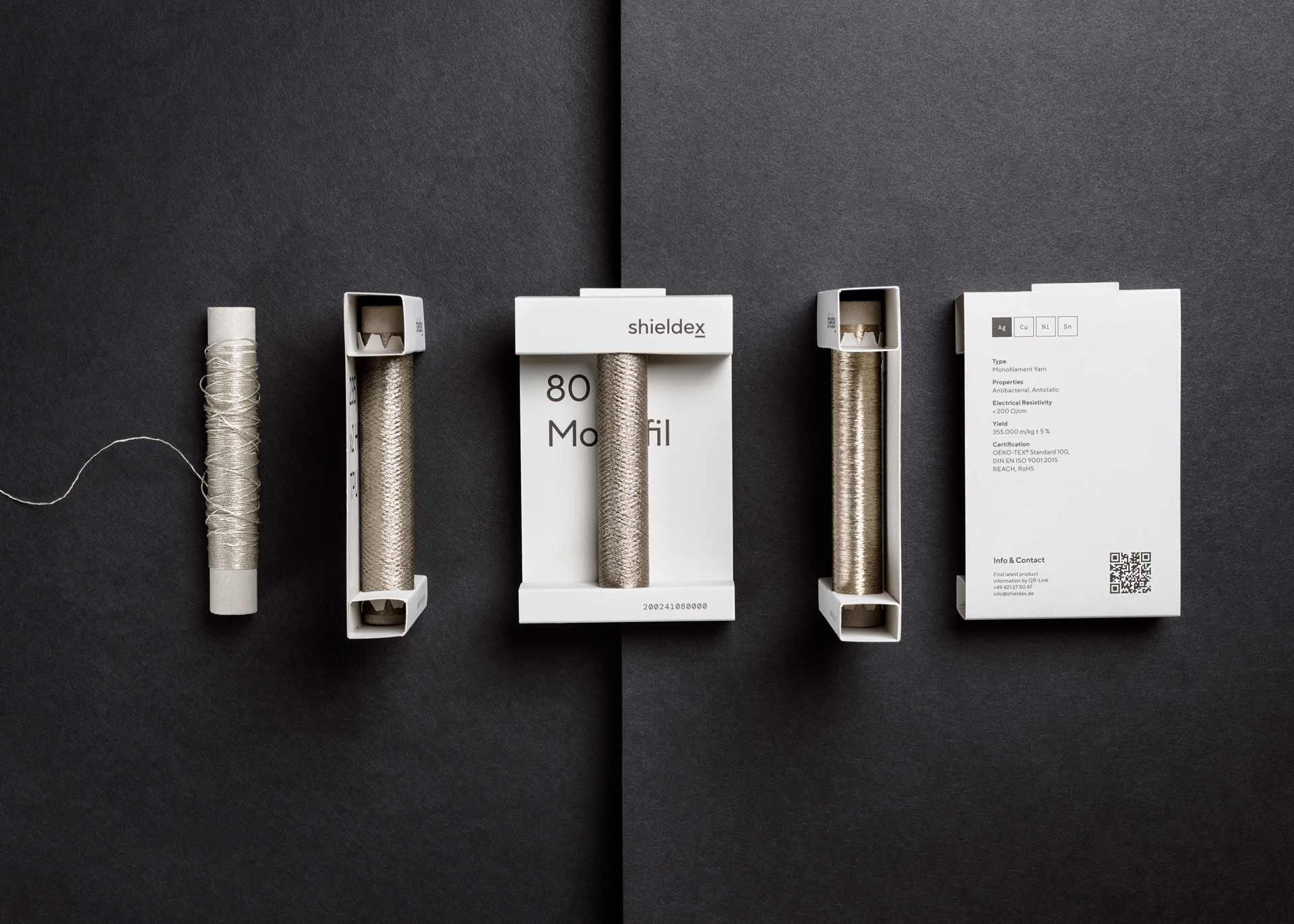
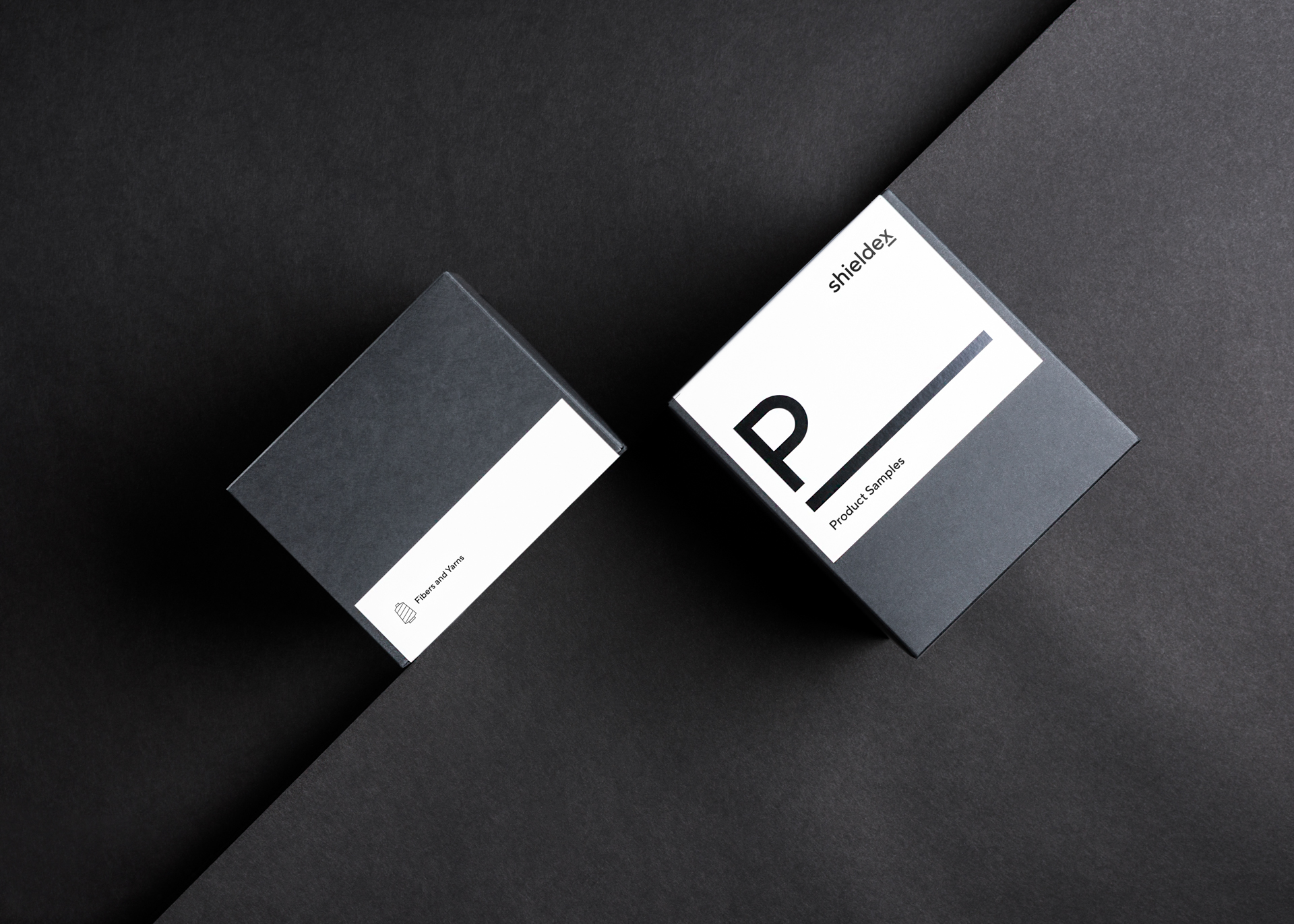
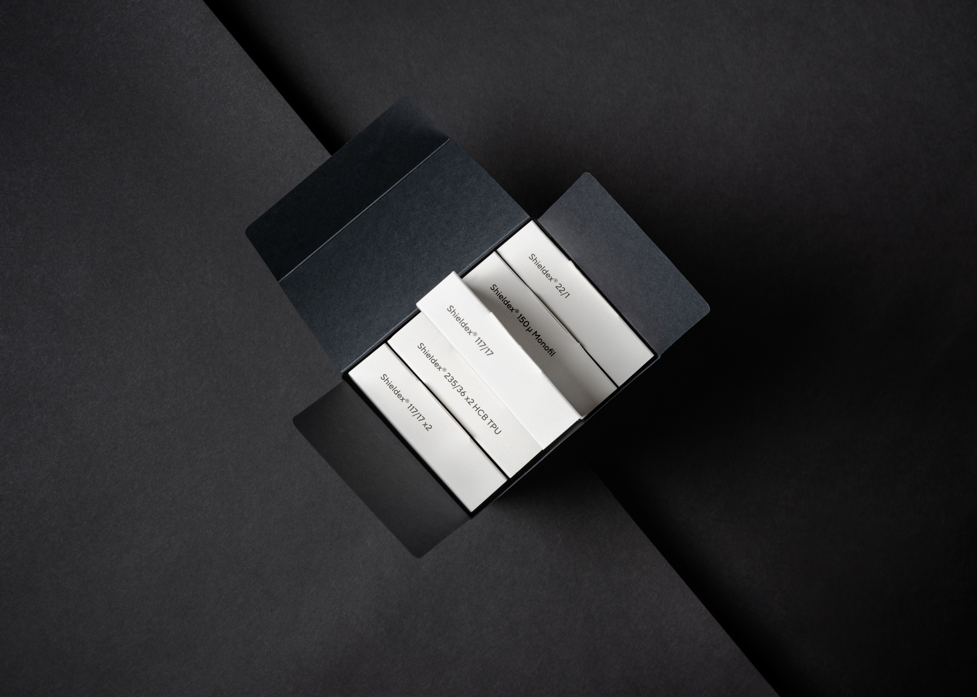
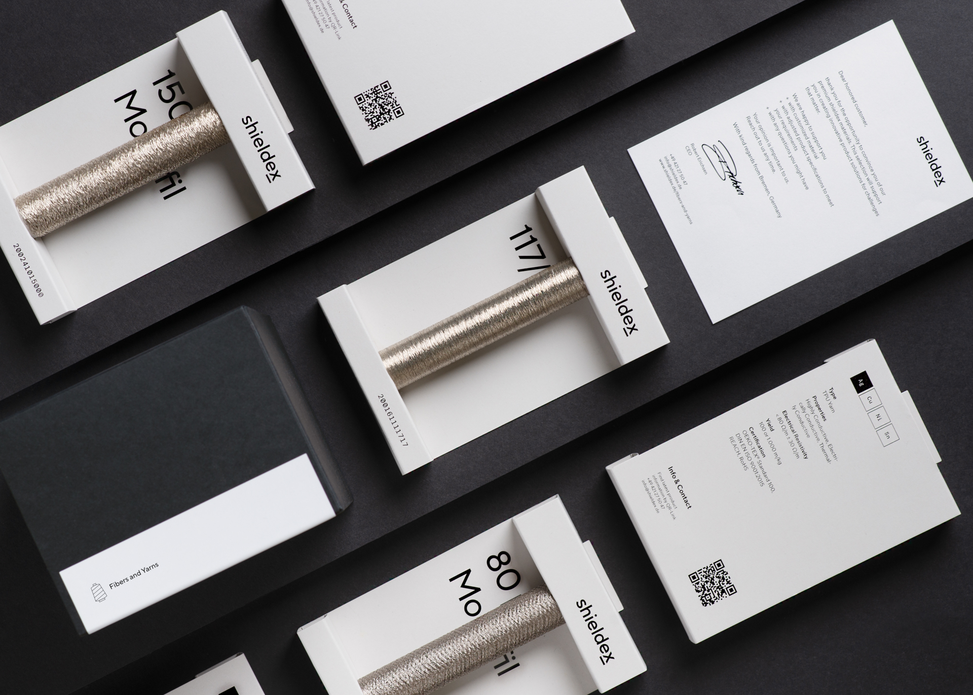
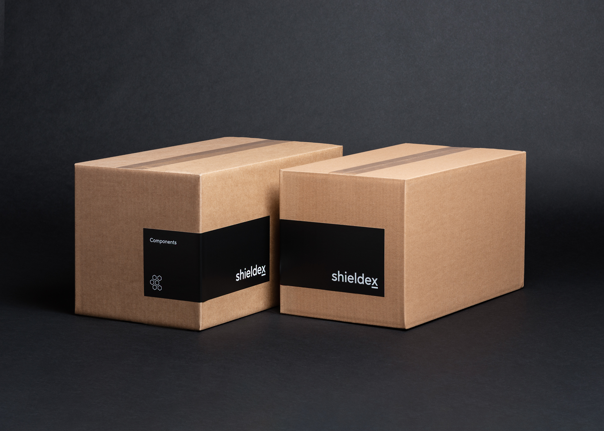
Physical and tactile manifestations
New packaging for product samples are designed to highlight a tactile experience, they present fabric and fibre samples along with key technical specifications. The reduced dimensions and paper-based flat-pack design minimises waste, shipping and packaging volume. This puts products within reach for interested parties and wins the eyes and heart of new customers.
Statex Produktions- und Vertriebs GmbH
Brand design
Monospace: Jonas Vogt, Anja Knust, Daniel Albert
Digital design
Monospace: Jonas Vogt
Photography
Matthias Leupold
Documentation
Maximilian Glas